Also just using a simple idea of a bright colour always draws attention, when used at the right amount anyway, which it is here.
This being a similar idea to what I had for the record label brief, using a bright colour on the front of the card, with the logo on, works here and works on mine.
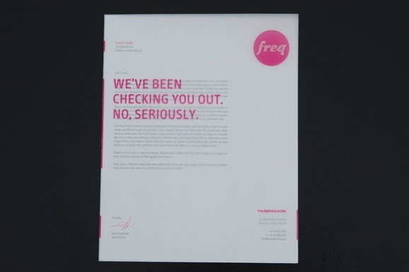
A fan of the unique letterheads, using tracing paper to print a bold message on, keeping in with visual identity of it, clever and refreshing.


No comments:
Post a Comment